Note
Go to the end to download the full example code.
Barplot#
Aggregate entity features across a SequencePool with
SequenceVisualizer.
Three aggregation modes are available:
show_as="count": raw occurrences per label (all pool types)show_as="rate": relative frequency, bars sum to 1 (all pool types)show_as="duration": total cumulated duration per label (interval / state pools only)
Imports#
import polars as pl

from tanat import build_intervals
from tanat.dataset import simulate_intervals, simulate_static
from tanat.visualization import SequenceVisualizer
Simulate data#
simulate_intervals() produces one row
per interval. The second feature (status) is categorical; it groups the bars.
temporal = simulate_intervals(
    n_ids=80,
    seq_length_range=(3, 12),
    features=["value", "status"],
    seed=42,
)
print(temporal.shape, temporal.columns.tolist())
(612, 5) ['id', 'start', 'end', 'value', 'status']
temporal.head()
Build the pool#
pool = build_intervals(
    temporal_data=temporal,
    id_column="id",
    start_column="start",
    end_column="end",
)
┌─ Interval SequenceStore
│
│ Step 1/4: Sorting & preparing data
│
│ Step 2/4: Building sequence index
│
│ Step 3/4: Writing entity & time index features
│
│ Step 4/4: Computing & writing metadata
│
└─ Done (80 sequences · 612 entities · 0.00s)
pool.cast_features({"status": pl.Categorical}, is_static=False)
print(pool)
┌────────────────────────────────────────────────┐
│          IntervalSequencePool Summary          │
└────────────────────────────────────────────────┘

Overview
─────────────────────────
  Sequences          80
  Store              /home/runner/.tanat/_quick_interval_a5e3778e
  id_column          id

Time Index
─────────────────────────
  Type               Datetime(time_unit='us', time_zone=None) [2000-01-06 04:30:56.712327 → 2025-01-20 12:52:39.461948]
  Columns            ['start', 'end']
  t0                 position=0, anchor=start

Entity Features (2)
─────────────────────────
  • status              Categorical (5 categories)
  • value               Numerical [1 → 100]
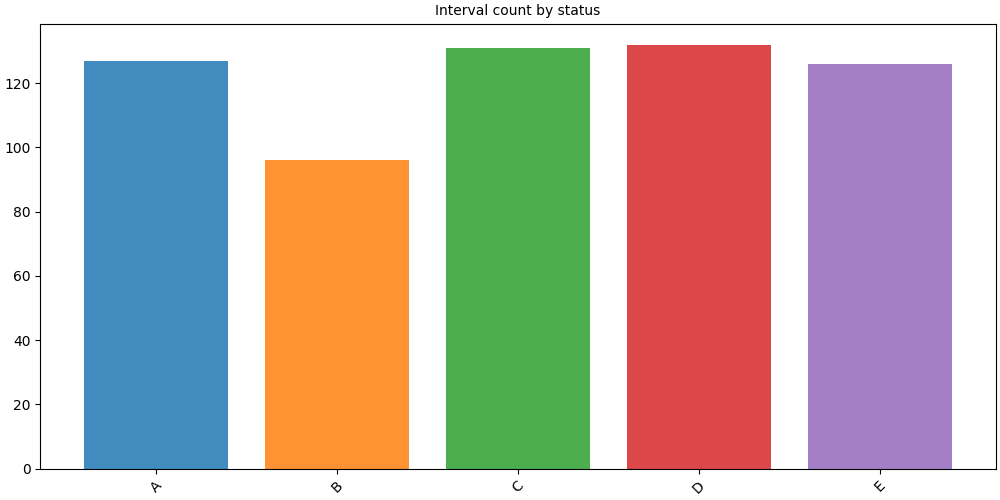
Count: occurrences per label#
show_as="count" (default) counts how many intervals carry each label.
# fmt: off
SequenceVisualizer.barplot(show_as="count") \
    .title("Interval count by status") \
    .draw(pool, entity_feature="status") \
    .show()
# fmt: on
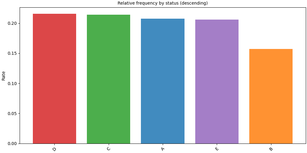
Rate: relative frequency#
show_as="rate" normalises counts so bars sum to 1.
Combine with sort="descending" to put the most frequent label first.
# fmt: off
SequenceVisualizer.barplot(show_as="rate", sort="descending") \
    .title("Relative frequency by status (descending)") \
    .y_axis(label="Rate") \
    .draw(pool, entity_feature="status") \
    .show()
# fmt: on
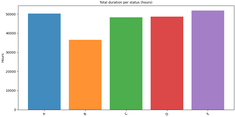
Duration: total time per label#
show_as="duration" sums end − start per label.
display_unit converts the result to a human-readable time unit.
Note
Duration mode requires an interval or state pool. Event pools (point observations) have no duration.
# fmt: off
SequenceVisualizer.barplot(show_as="duration", display_unit="hours") \
    .title("Total duration per status (hours)") \
    .y_axis(label="Hours") \
    .draw(pool, entity_feature="status") \
    .show()
# fmt: on
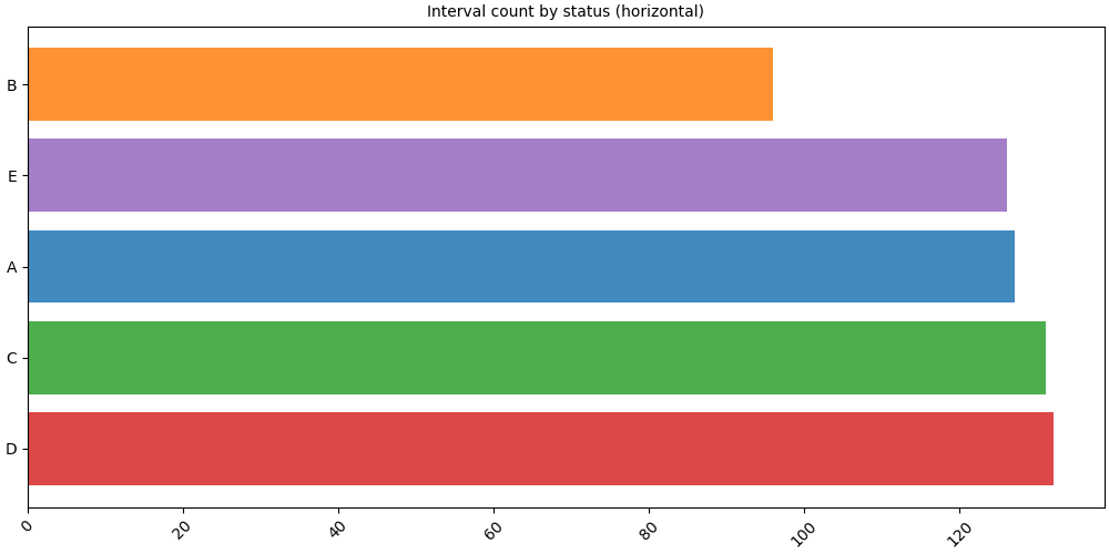
Horizontal orientation#
orientation="horizontal" flips the axes, handy when label names are long.
# fmt: off
SequenceVisualizer.barplot(
    show_as="count",
    orientation="horizontal",
    sort="descending",
) \
    .title("Interval count by status (horizontal)") \
    .draw(pool, entity_feature="status") \
    .show()
# fmt: on
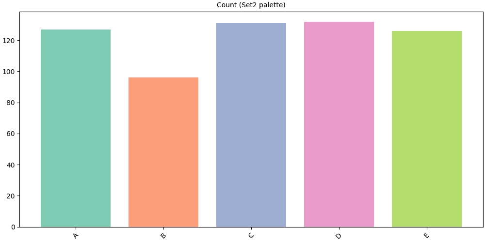
Color customization#
The .colors() method accepts three formats:
Named colormap string:
"Set2","tab10","Pastel1", …Dict mapping label → hex color
No argument (default): matplotlib default color cycle
# Named colormap
# fmt: off
SequenceVisualizer.barplot(show_as="count") \
    .colors("Set2") \
    .title("Count (Set2 palette)") \
    .draw(pool, entity_feature="status") \
    .show()
# fmt: on
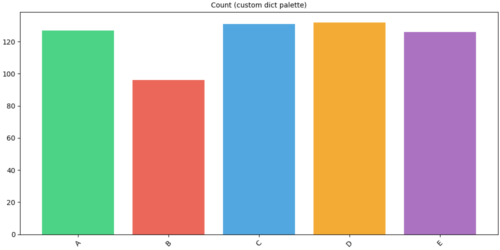
# Explicit dict: one color per label
palette = {
    "A": "#2ecc71",
    "B": "#e74c3c",
    "C": "#3498db",
    "D": "#f39c12",
    "E": "#9b59b6",
}
# fmt: off
SequenceVisualizer.barplot(show_as="count") \
    .colors(palette) \
    .title("Count (custom dict palette)") \
    .draw(pool, entity_feature="status") \
    .show()
# fmt: on
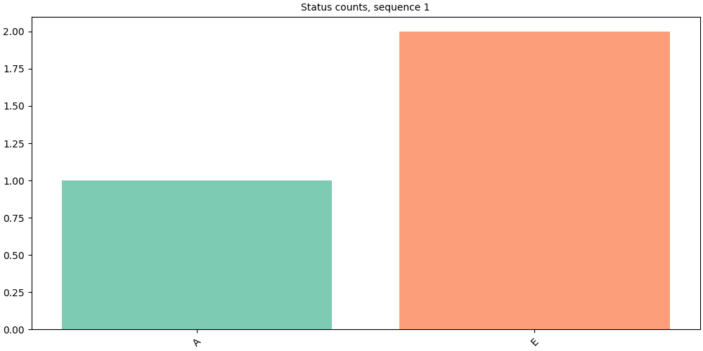
Single sequence#
Pass a Sequence directly for a per-individual view.
seq = pool[pool.unique_ids[0]]
print(f"ID {seq.id_value}: {len(seq)} intervals")
ID 1: 3 intervals
# fmt: off
SequenceVisualizer.barplot(show_as="count") \
    .title(f"Status counts, sequence {seq.id_value}") \
    .colors("Set2") \
    .draw(seq, entity_feature="status") \
    .show()
# fmt: on
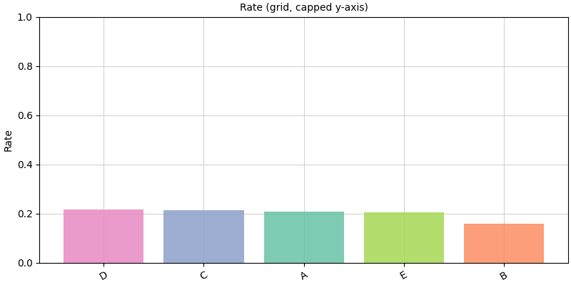
Layout and style#
# Grid + capped y-axis
# fmt: off
SequenceVisualizer.barplot(show_as="rate", sort="descending") \
    .figsize(8, 4) \
    .grid() \
    .x_axis(rotation=30) \
    .y_axis(limit_max=1, label="Rate") \
    .colors("Set2") \
    .title("Rate (grid, capped y-axis)") \
    .draw(pool, entity_feature="status") \
    .show()
# fmt: on
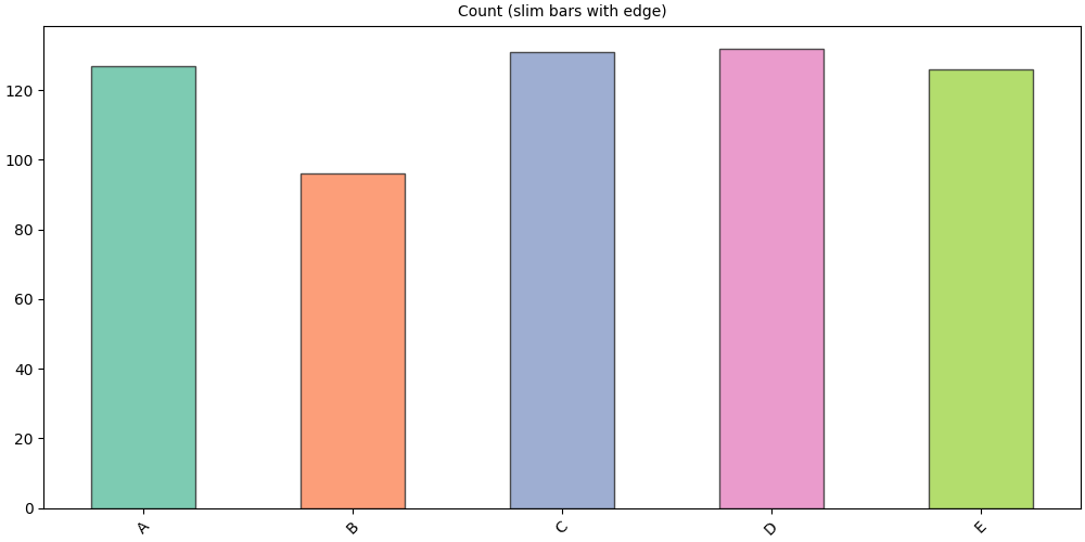
# Slim bars with a visible edge
# fmt: off
SequenceVisualizer.barplot(show_as="count") \
    .colors("Set2") \
    .marker(bar_width=0.5, alpha=0.85, edge_color="#333333") \
    .title("Count (slim bars with edge)") \
    .draw(pool, entity_feature="status") \
    .show()
# fmt: on
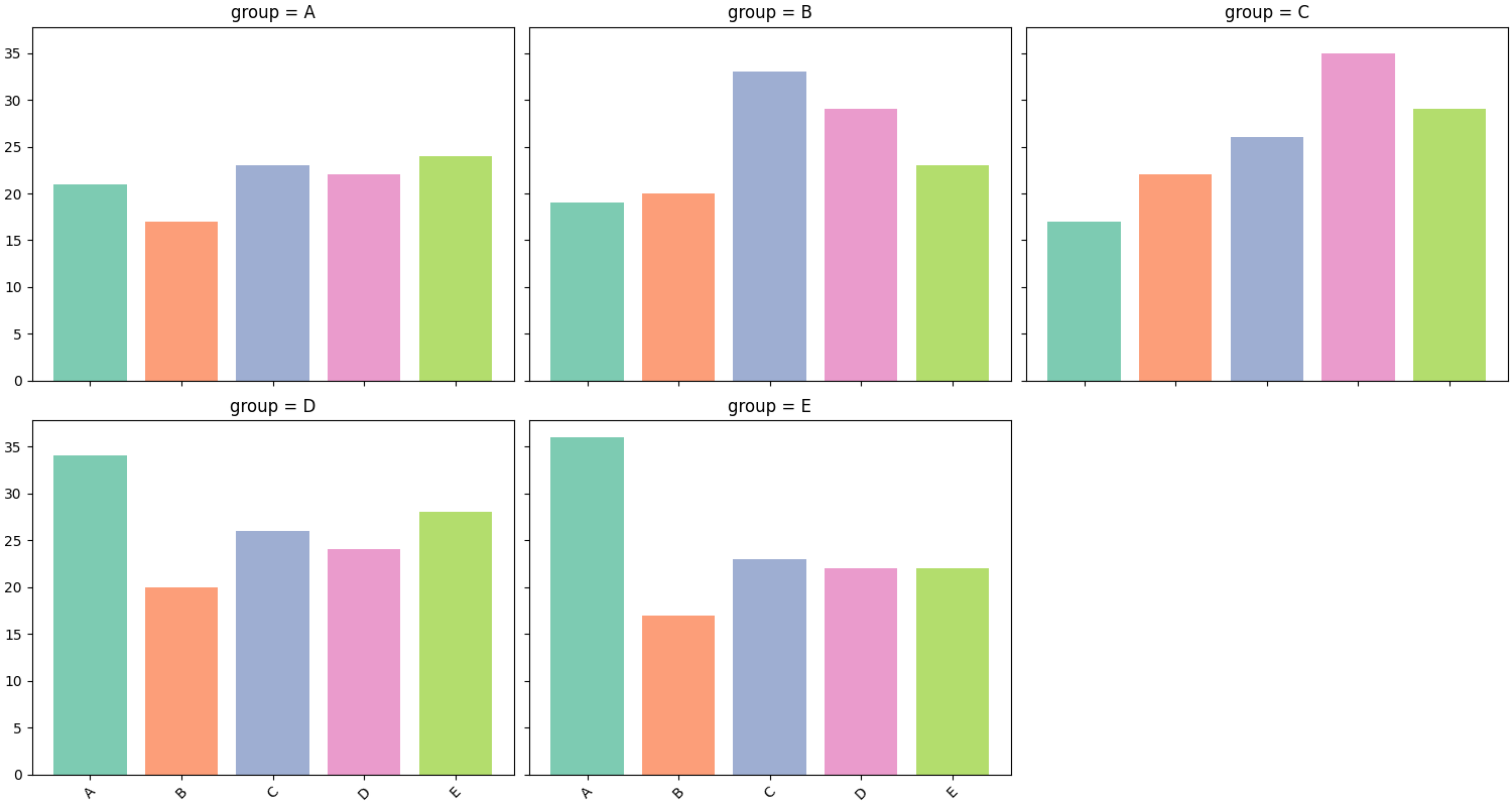
Faceting#
.facet() splits the chart into a grid of panels, one per unique value
of a chosen feature. Here we attach per-sequence static data and facet on
group.
static_df = simulate_static(n_ids=80, features=["age", "group"], seed=0)
pool.add_static_features(static_df)
pool.cast_features({"group": pl.Categorical}, is_static=True)
# fmt: off
SequenceVisualizer.barplot(show_as="count") \
    .facet(by="group", is_static=True, cols=3) \
    .colors("Set2") \
    .draw(pool, entity_feature="status") \
    .show()
# fmt: on
Inspect prepare_data()#
prepare_data() returns the aggregated Polars DataFrame before rendering.
The result is cached: calling .draw() on the same builder reuses it.
builder = SequenceVisualizer.barplot(show_as="rate", sort="descending")
df = builder.prepare_data(pool, entity_feature="status")
df
Total running time of the script: (0 minutes 1.182 seconds)